
What an accessibility check can tell you
Website accessibility testing asks whether people can perceive, understand, navigate, and operate a page in different ways. That includes people who use a keyboard instead of a mouse, enlarge text, reduce motion, change contrast, or rely on a screen reader.
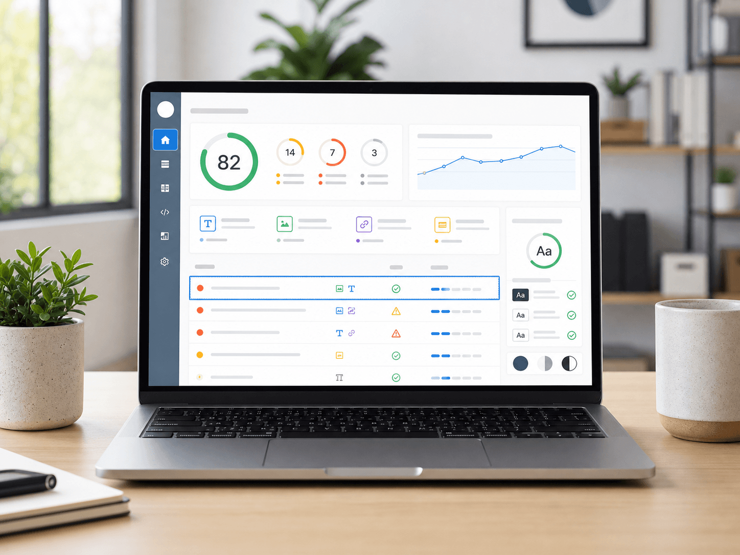
An automated scan is a useful first pass because it can inspect repeatable code patterns quickly. It can find issues such as missing image alternatives, unlabeled form controls, invalid ARIA relationships, empty links, and some color contrast failures. It cannot reliably judge whether alternative text is useful, instructions are understandable, focus order makes sense, or a task is genuinely usable.
The W3C describes its own Easy Checks as a first review rather than a definitive evaluation. Use the same mindset for any scanner: start with automation, then test how the page actually behaves.
Step 1: Run an automated scan
Begin with a representative public page, ideally one that contains navigation, images, forms, buttons, and interactive components. Run the free website accessibility checker and group the results by rule instead of treating every failed element as a separate problem.
Prioritize findings that can block an entire task:
- Controls without accessible names
- Images that communicate information but have no alternative text
- Form inputs without labels or usable error messages
- Interactive elements that cannot receive keyboard focus
- Text with insufficient contrast against its background
- Broken heading, landmark, or ARIA relationships
Repeat the scan after changes. A clean automated result means the tested rules did not find a barrier on that page; it does not prove that the complete website conforms to WCAG.
Check focused issues with the right tool
Use a color contrast checker for exact foreground and background combinations, an alt text checker for image markup, and a form label checker when forms are central to the page. Focused tools make it easier to confirm a fix without rerunning an entire audit.
Step 2: Test keyboard navigation
Put the mouse aside and reload the page. Use Tab to move forward, Shift + Tab to move backward, Enter to activate links or buttons, Space where appropriate, and arrow keys inside components such as menus, tabs, and radio groups.
Check that:
- Every interactive control can be reached.
- Focus is always visible and is not hidden behind a sticky header or modal.
- Focus order follows the visual and logical reading order.
- Opening a menu, dialog, or drawer moves focus to a useful location.
- Closing that component returns focus to the control that opened it.
- There is no keyboard trap.
The keyboard navigation checker can identify markup risks, but the complete path still needs a person pressing the keys.
Step 3: Check zoom and reflow
Zoom the browser to 200% and inspect the page at a narrow viewport. Content should reflow without forcing horizontal scrolling for ordinary text, and controls should not overlap, disappear, or become impossible to operate.
Pay particular attention to navigation, data tables, sticky controls, cookie banners, dialogs, and fixed-position widgets. Text should remain readable when it grows, and important information should not be clipped by a fixed height.
Step 4: Review content and forms
Code can be technically valid while the experience is still confusing. Read the page as a first-time visitor and inspect the relationships between visible content and accessible names.
- Page titles and the main heading should identify the page clearly.
- Heading levels should describe the content structure rather than imitate a font size.
- Link text should explain its destination without relying on nearby visual context.
- Instructions and validation errors should identify both the problem and the correction.
- Required fields should be communicated in text or programmatically, not only by color.
- Alternative text should convey an image's purpose in the current context.
W3C notes that automation can detect a missing alt attribute, but a person must decide whether the alternative is appropriate. That distinction applies to many accessibility checks: presence can be automated more easily than quality.
Step 5: Use a screen reader
Test at least the most important user journeys with a screen reader available on your operating system, such as VoiceOver on macOS and iOS, Narrator on Windows, or TalkBack on Android. You do not need to become an expert user before basic testing starts, but avoid declaring a page accessible from a few keystrokes alone.
Listen for page title, headings, landmarks, control names, state changes, form instructions, validation errors, and announcements after dynamic updates. Confirm that the same task can be completed without relying on visual position.
Turn findings into a remediation plan
Record each finding with the page, component, expected behavior, actual behavior, relevant WCAG success criterion, severity, evidence, and owner. Fix shared components before page-specific instances because one navigation or form component may remove the same barrier across many routes.
A practical sequence is:
- Fix task-blocking keyboard, form, and naming failures.
- Repair shared components and templates.
- Address contrast, structure, and content quality issues.
- Rerun automated checks and repeat manual journeys.
- Add regression checks to development and release workflows.
For a broader view across public routes, use a deep accessibility scan. Development teams can move repeatable checks closer to pull requests with the source code scanner. Neither replaces user testing, but both reduce the chance that known patterns quietly return.
Accessibility is not a one-time score. It is a testing discipline that combines automation, human judgment, and regular regression checks.